Everything you need to build, edit, brand, and export a Gantt chart. Nothing is uploaded anywhere — the builder runs entirely in your browser and autosaves your work locally.
1. Getting started
Open the builder and pick a starting point.
Click Open the builder (top right) — it opens to a blank project.
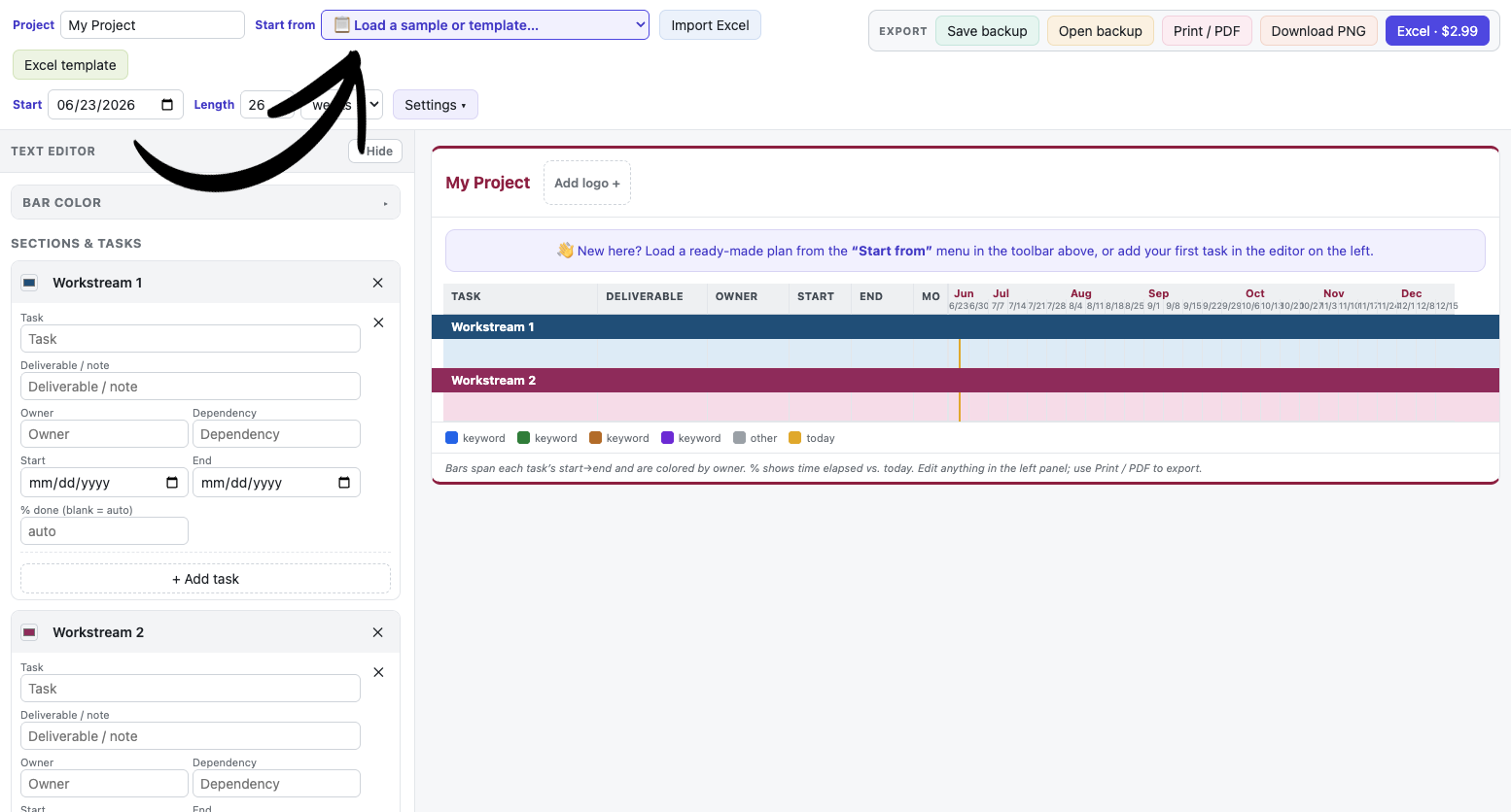
To start from a ready-made plan, use the called-out Start from menu in the toolbar and choose a Sample project (Construction, Marketing, Clinical, Wedding) or a Starter — it fills the chart with example tasks you can edit.
Prefer to build from scratch? Just start typing in the editor on the left (next section).
Your work saves automatically in this browser between visits. To keep a portable copy or move it to another computer, use Save backup (see Saving & backups).
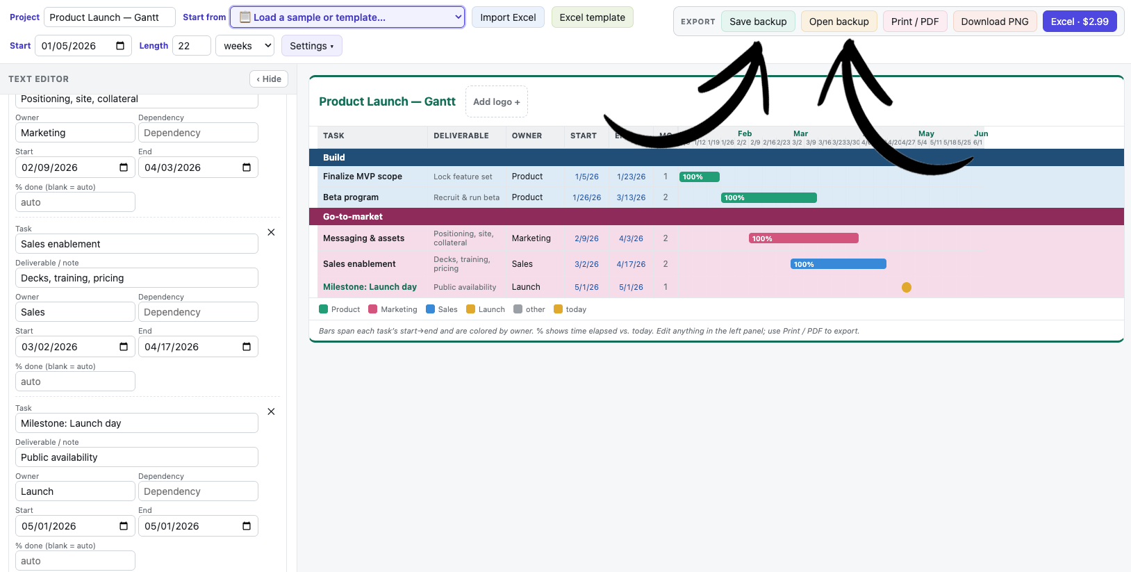
The toolbar with the “Start from” menu, where you pick a sample or a blank chart.
2. The screen layout
Three areas: the toolbar on top, the editor on the left, and the chart on the right.
Toolbar — grouped into Setup (project name, Start from, Import Excel, Excel template), View (Start, Length, Settings, backups), and an Export box on the far right.
Text editor (left panel) — where you add and edit sections, tasks, and colors. Collapse it with the ‹ Hide button in its header; bring it back with the › handle.
Chart (right) — updates live as you type.
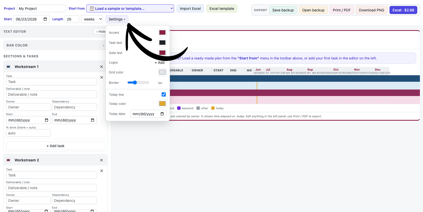
Settings ▾ — a popover holding accent, task/gate text colors, logos, grid styling, and the today-line controls.
3. Sections & tasks
A chart is made of sections (stages), each containing tasks.
Add & edit
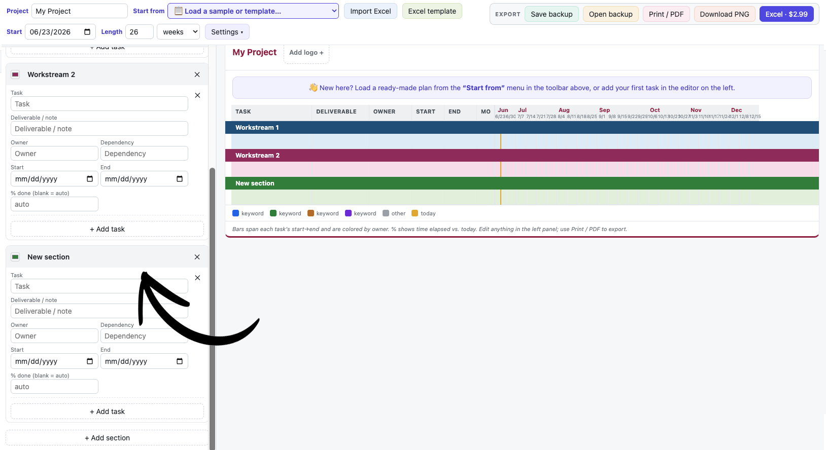
Click + Add section in the editor, then name it.
Under a section, click + Add task and fill in the fields: Task name, Deliverable / note, Owner, Dependency, Start and End dates, and an optional % done.
The chart bar draws itself from the Start and End dates.
Remove a task or section with the ✕ button next to it.
Adding a section and a task in the editor panel.
4. Dates & the timeline
Frame the timeline, then choose how finely it's divided.
Set the chart Start date in the toolbar.
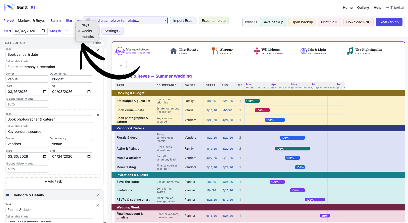
Set Length (a number) and the unit: days, weeks, or months. The column headers adapt automatically.
Each task's bar spans its own Start→End dates within that timeline.
The Start date, Length, and the days / weeks / months unit.
5. Bar colors (owners / keywords)
Bars are colored by matching a keyword to a color.
Open the Bar color section at the top of the editor.
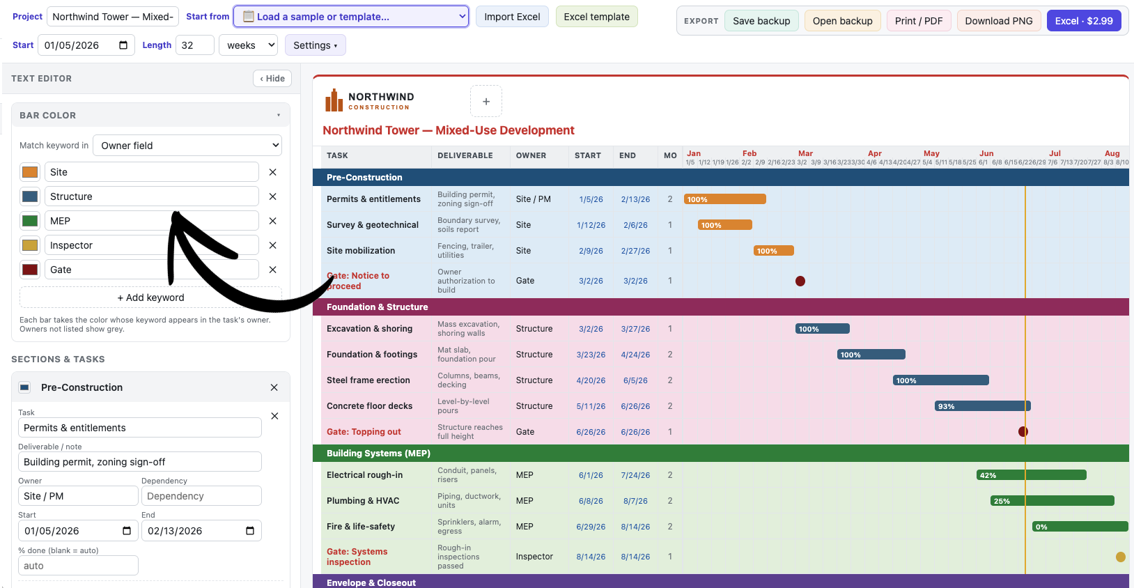
Each row is a keyword → color pair. A bar takes the color of the first keyword it matches.
Choose where to look with Match keyword in: Owner field (default) or Anywhere in the row (task, deliverable, owner, or dependency).
Click + Add keyword to add more. Bars that match nothing show grey ("other").
Tip: short, distinctive keywords work best (e.g. CISO, MEP, Gate).
The Bar color panel — keyword/color list and the “Match keyword in” option.
6. Section colors
Each section gets a band color from the palette — change it per section.
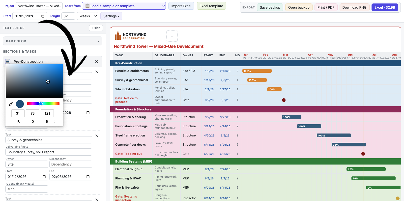
In the editor, click the small color swatch to the left of a section's name.
Pick any color. That section's band uses it, and the rows below get a soft tint of the same color.
Click a section’s color swatch in the editor to recolor its band.
7. Task & gate text colors
Control the color of task names.
Open Settings ▾ in the toolbar.
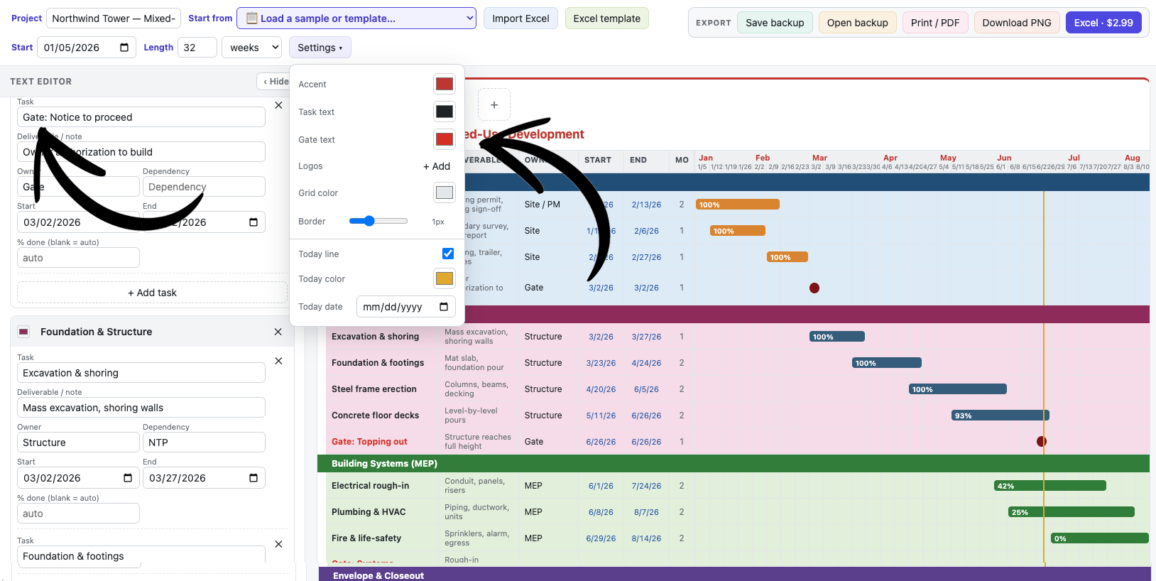
Task text sets the color of normal task names.
Gate text sets the color of gate/milestone names (defaults to the accent color). Gates also stay bold.
The Settings popover with the Task text and Gate text color pickers.A gate/milestone task shown in its own (accent) text color on the chart.
8. Progress (% complete)
Each bar can show a percentage — automatic or manual.
Automatic: if you leave it blank, the % is calculated from the dates vs. today (0% before the start, 100% after the end). This means a past-dated task reads 100%.
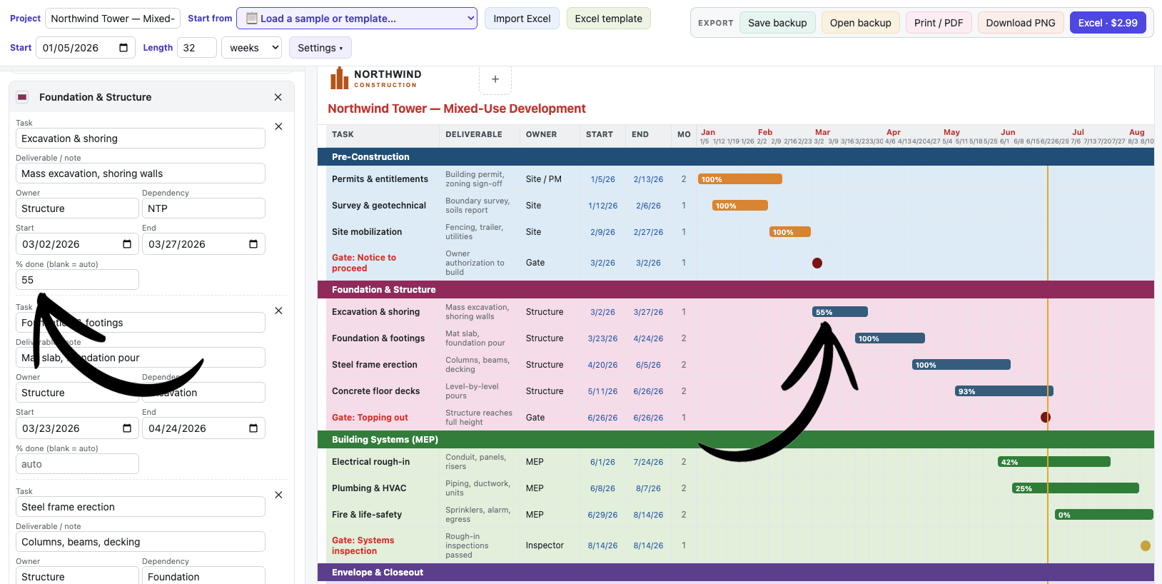
Manual: type a number in the task's % done field, or simply click the bar on the chart and type the percentage right there. Clear it to go back to automatic.
Click a bar on the chart to type its % complete inline.
9. The "today" line
The colored vertical line marks the current date.
It tracks the real date automatically and only appears when today falls inside the chart's range.
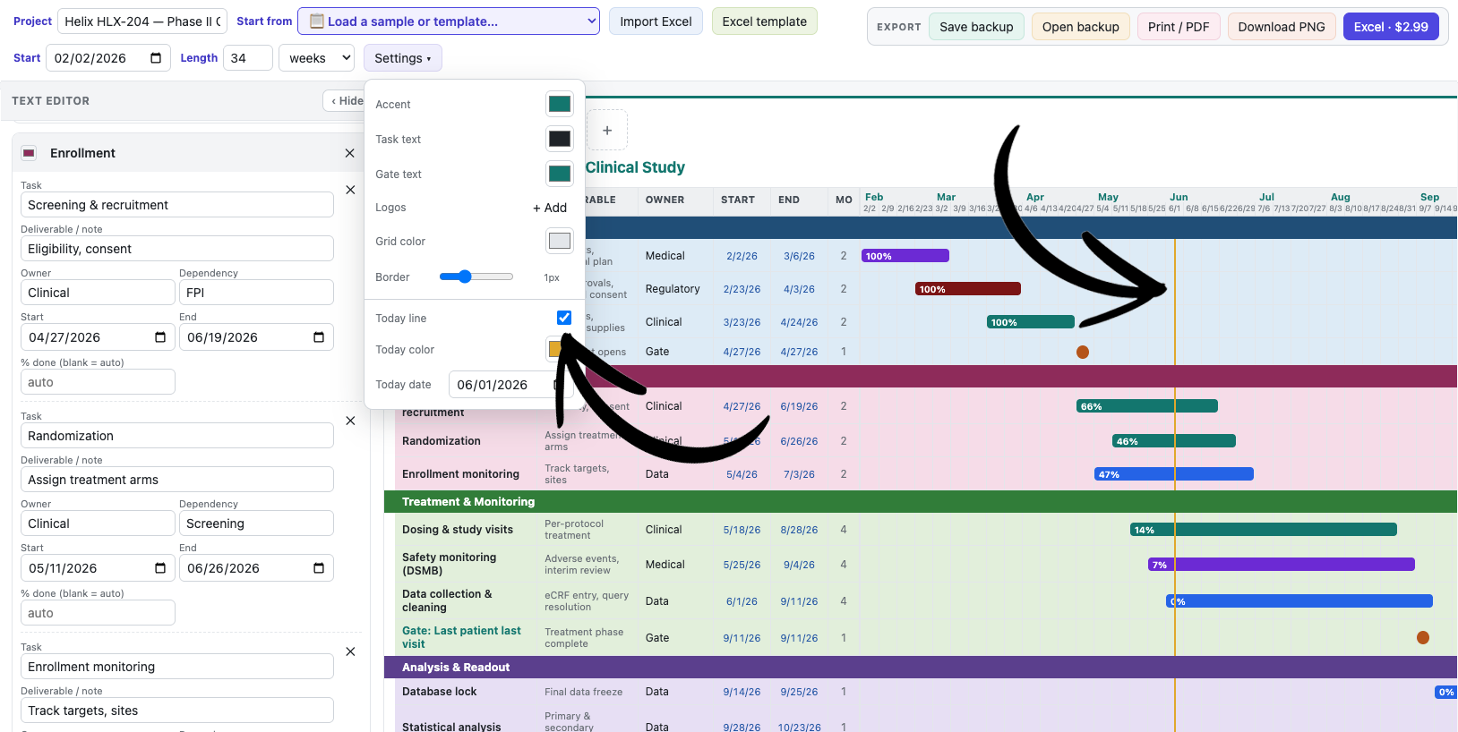
In Settings ▾ you can: turn the Today line on/off, change its color, and set a Today date to pin it to a fixed "as-of" date (which also drives the automatic % complete). Leave the date blank to track the real today.
The today line and its Settings controls (show/hide, color, date).
10. Title, accent & logos
Make the chart look like yours.
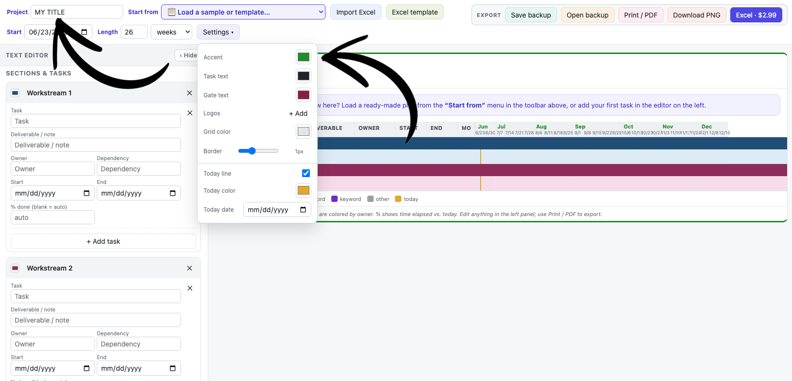
Type a Project name in the toolbar — it appears as the chart title.
In Settings ▾, set the Accent color (used for the title, header accents, and gate text by default).
Add Logos from Settings (or the Add logo + button on the chart header). Logos run along the top of the chart; add several and remove any with its ✕.
The project title and chart header.
11. Grid styling
Fine-tune the chart's grid lines.
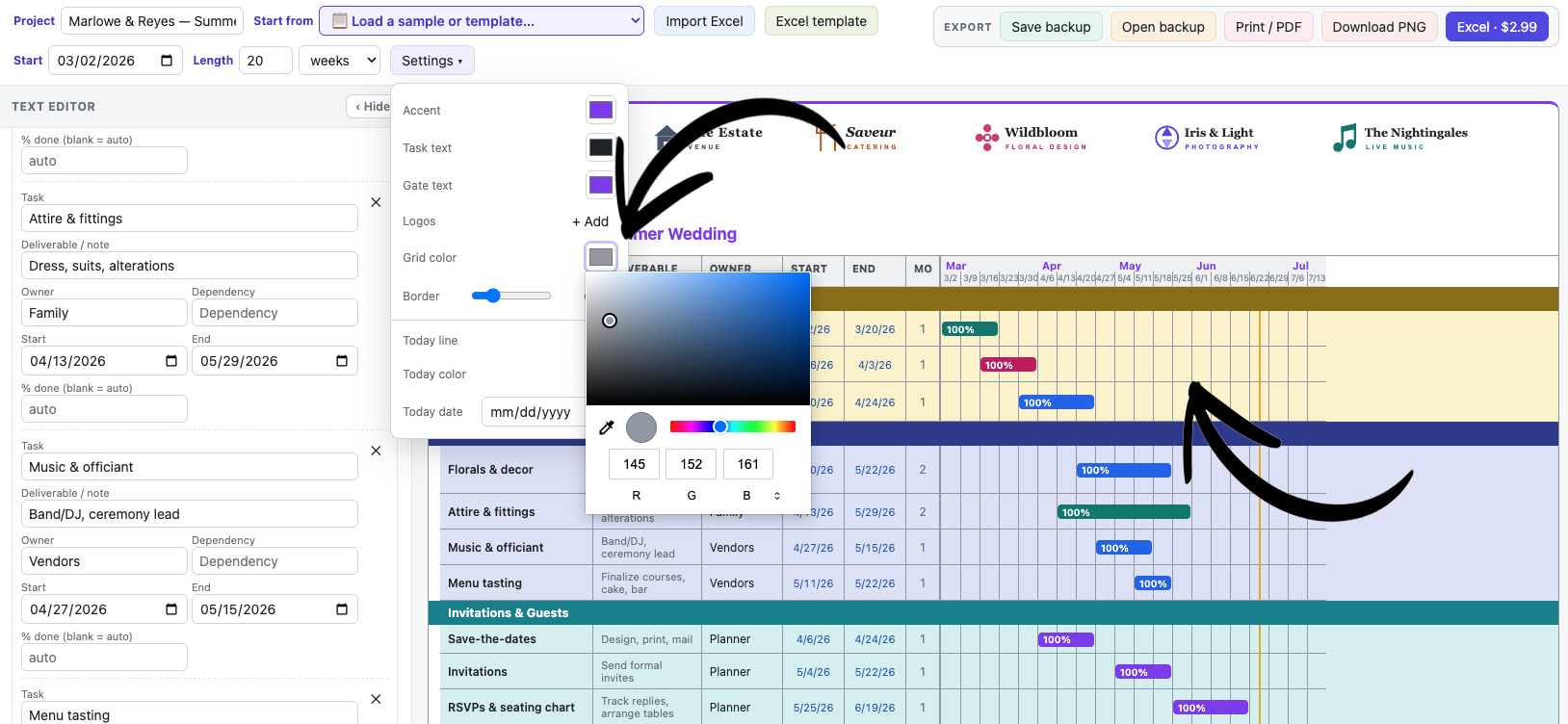
In Settings ▾, set the Grid color and Border thickness (0–4px).
These affect only the Gantt chart — not the rest of the page.
Grid color and border-thickness controls in Settings.
12. Milestones & gates
Mark key checkpoints as single-point markers.
Give a task the same Start and End date, or start its name with "Gate:" or include "Milestone".
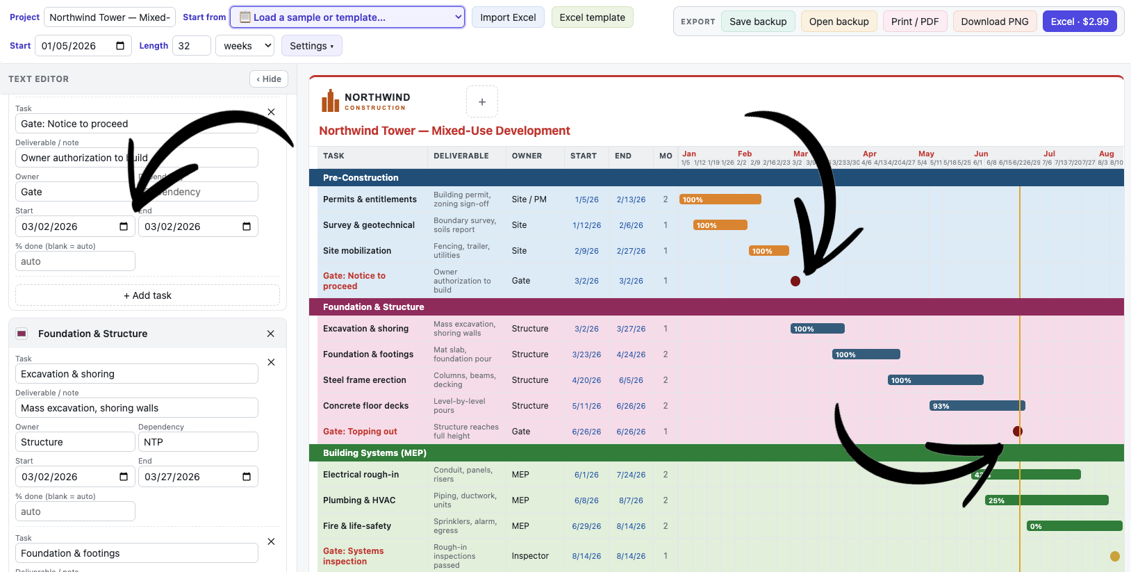
It renders as a diamond instead of a bar, in bold, using the gate-text/accent color.
A milestone/gate shown as a diamond (same start and end date).
13. Saving & backups
Your work is saved automatically; backups are for portability.
Autosave — every edit is saved in this browser. Reopening the builder resumes your last project. (It only remembers one project at a time.)
Save backup — downloads a .json file of the whole project. Use it to keep multiple projects, back up, or move to another computer/browser.
Open backup — loads a .json backup back into the builder. (The .json only opens in this builder, not in other programs.)
Save backup / Open backup in the Export area.
14. Exporting
Get your chart out as an image, a PDF, or a styled spreadsheet.
Download PNGfree — a crisp image of the whole timeline.
Print / PDFfree — print or save to PDF (colors included).
Excel templatefree — a blank spreadsheet to fill in, and Import Excel reads a filled-in copy back into the builder.
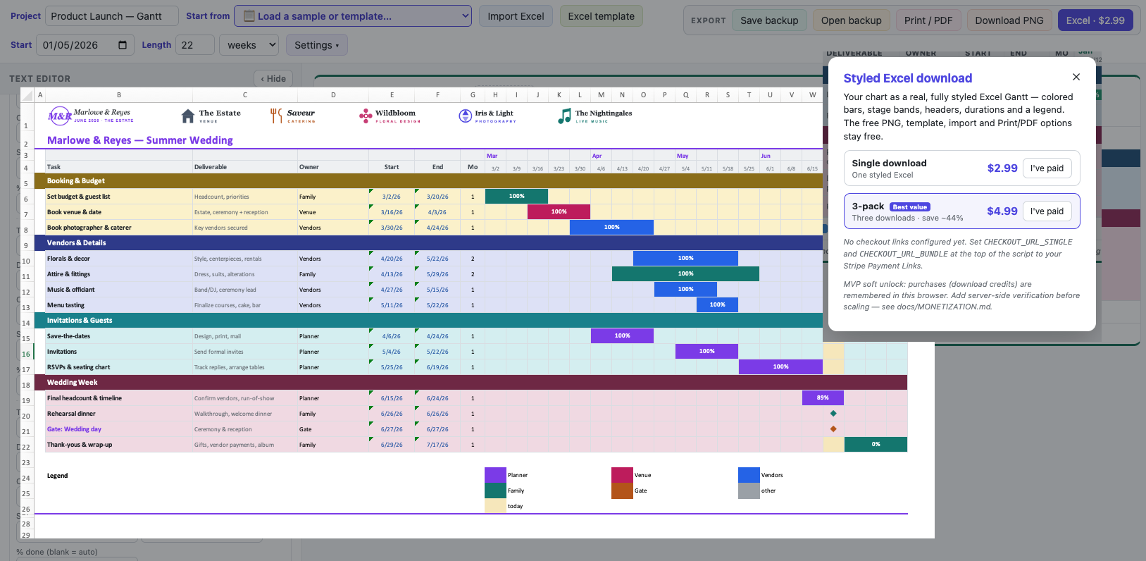
Styled Excel · $2.99paid — a fully formatted .xlsx Gantt with your logo, colors, bands, bars, today marker, and legend.
The PNG and Styled-Excel buttons load a small helper library from the internet the first time you use them in a session, so an internet connection is needed for that first export. Print / PDF works offline.
The Export box and an example of the downloaded styled Excel file.
15. Building from a spreadsheet (the Excel template)
Prefer to type your plan in a spreadsheet? Fill in the free template and import it.
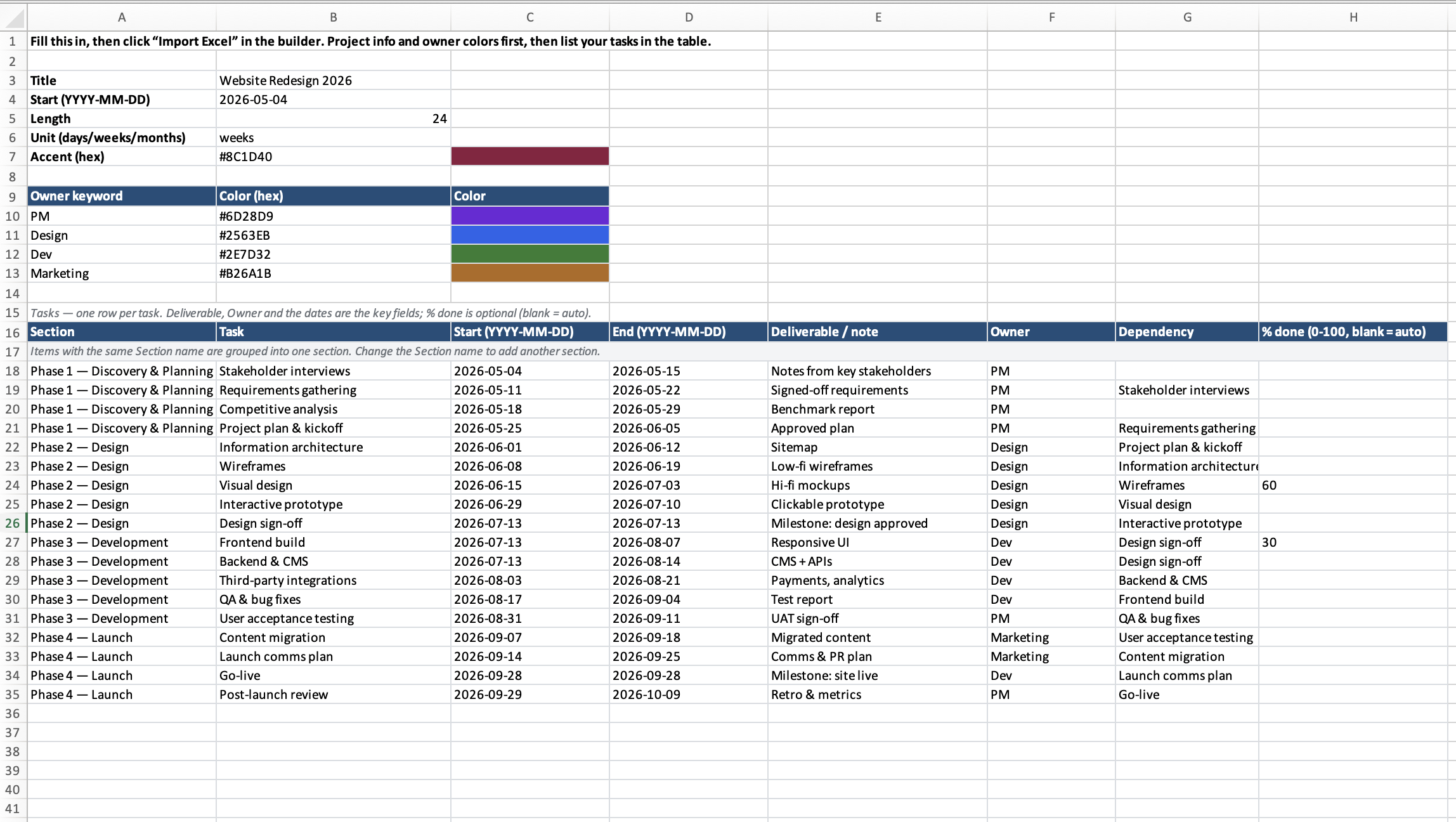
Click Excel template in the toolbar to download a blank .xlsx — everything is on one sheet.
At the top, fill in the project info: Title, Start date, Length (a number), Unit (days, weeks, or months), and Accent color. Just below, list your Owner keyword → Color pairs — a color chip shows each one, and these drive the bar colors. A color palette beside it gives eight ready-made hex codes you can copy in.
In the task table, add one row per task: Section, Task, Start, End, Deliverable / note, Owner, plus an optional % done (0–100; blank = automatic).
Sections: items with the same Section name are grouped into one section — change the Section name to start a new one. The template includes a worked example and spare blank rows to extend.
Back in the builder, click Import Excel and pick your filled-in file — it replaces the current chart.
Dates can be YYYY-MM-DD or M/D/YY — both work. Styling such as section colors and task/gate text colors isn't part of the template; set those in the builder after importing.
The Excel template — project info and owner colors at the top, then the task table.↑ Back to top
Still stuck? Open the builder and experiment — nothing is saved online, so you can't break anything. Palm Tree IQ · Contact · by Palm Tree IQ